stair landing refresh
small space making a big impact.
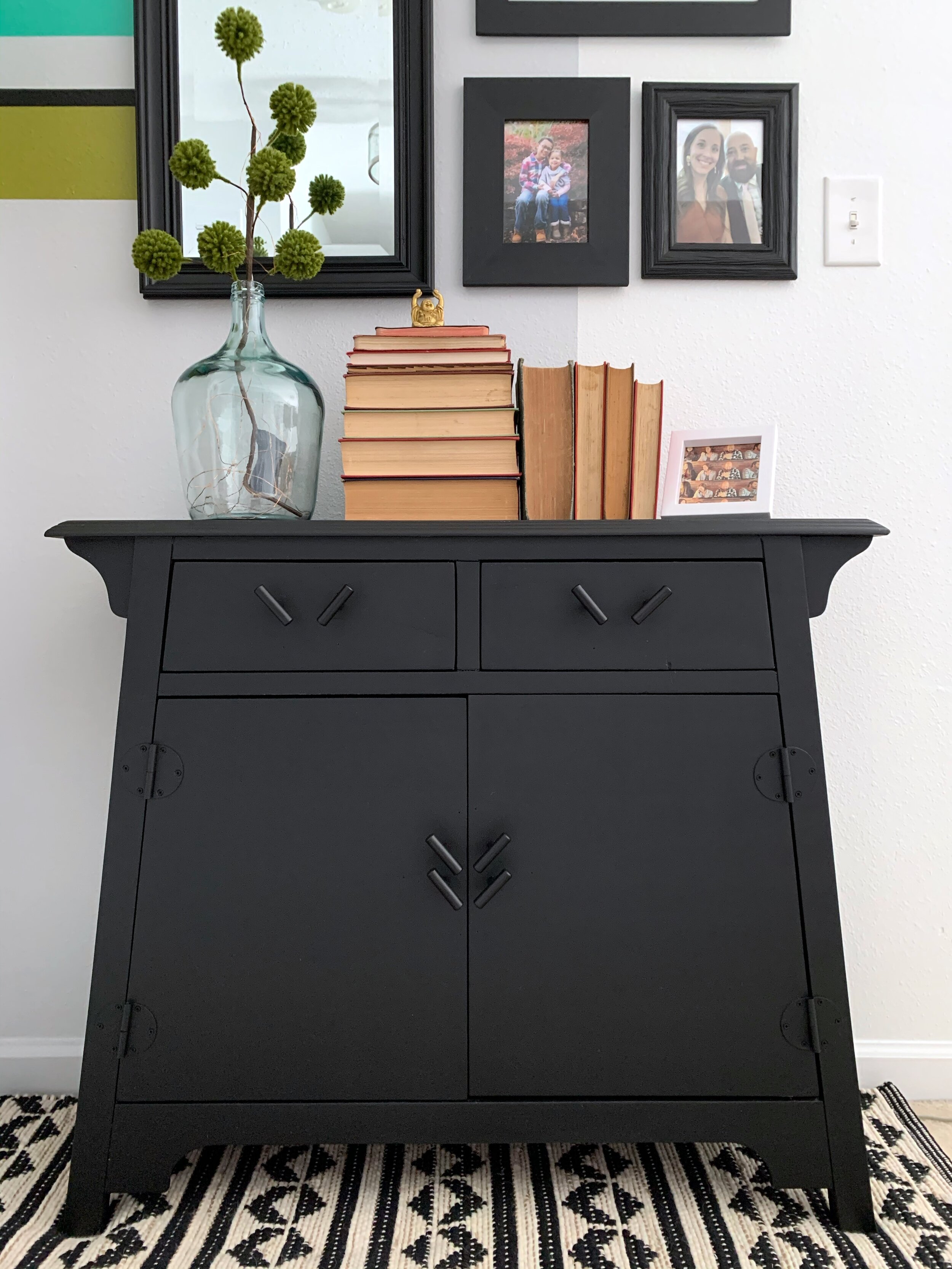
We love the open loft, most of the time, and I thought the little nook off of the stair landing would be a fun space to do something. The red cabinet in the second photo came from friends of ours; I’m not a big fan of red, so I knew I’d refinish it at some point. However, it took me a while to get around either of these projects. I tuck them away until I have the time, money, and/or resources (or even impetus) to actually make them happen. Well, with spring right around the corner (this being in late February 2021) and after repainting our entire entry last fall, I decided to use that extra cool grey paint and give this area a fresh look.
Design consistency is important. Whether it’s incorporating similar colors, patterns, and/or textures, creating a cohesive look throughout your space(s) helps it flow and ultimately feel better. This is why I decided on an arch for the nook - the same paint color (Valspar Bay Waves) as the entry arch I painted - blog post to come. I also wanted to add softness to the straight, harsh lines of the mirror and frames.
Rather than paint the arch strictly on one wall (behind the photos and cabinet), I wanted the abstraction and dimension that’s created when painted on perpendicular walls. I did quite a bit of this with the mural in our master bedroom, which you can read about in my very first blog post here.
Now, choosing the “right” paint colors for this space: since the nook is located just outside of my office/studio/guest bedroom, I wanted the colors to complement the bright colors - from all of the artwork - hanging around the room (see second photo above). For instance, if you read my master bedroom or bathroom blog post, the green I used in those rooms is definitely toned-down and more of a calm green from the crushed oregano I chose for the nook. This color palette is fun, vibrant, and just enough to make you smile.
STRIPE PAINTING PROCRESS
I chose a variety of thicknesses for the stripes to create more dimension and interest. Depending on the number of stripes and paint colors, there might be multiple layers and steps of painting.
In this instance, the progress photos show two steps: 1. painting the orange, gray, green, and 2. painting the aqua and black. I waited about two-hours (or even overnight) between each coat, two coats for each color. And I use FrogTape (the green tape) on older paint, usually the base wall paint that isn’t super fresh; then, the blue painters tape I use on fresh paint. I’ve found that the FrogTape is much stickier and has a tendency to peel a little paint, especially when it’s fairly fresh. However, both tapes still do a great job of creating crisp lines. The best advice for painting crisp lines is to actually paint over the tape edges with the base layer paint color to help with initial bleeding and act as a seal. The amount of touch-ups after tape-peeling are slim, which makes it that much sweeter!
Lastly, new cabinet knobs. The original cabinet hardware was not the standard sizing. So, I had to improvise. My first thought was to keep them straight and just have multiple knobs to cover the extra holes from not finding handle pulls. Once I started installing the new ones, I realized how great they would look at an angle to coordinate with the geometric rug. It turned out to be a happy accident. And sure, I could’ve filled in the extra holes prior to spray-painting the cabinet, but that would be more work for a quick, inexpensive project! Add back in the aged books from my grandparents’ house and updated greenery, we have ourselves a brighter, refreshed nook!
THE FINAL PHOTOS
What do you think of the final design? Anything you would do differently?
Now, when to refresh the actual loft… stay tuned because sometimes ya never know when I’ll get the urge to work on a new project! ;)
SOURCES
Click on any picture below to visit the source website directly.


